R语言基础绘图——折线图
应用R语言绘制简单的折线图
示例数据:
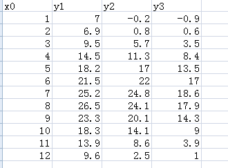
方法一:采用plot函数绘制折线图
setwd("d:/huitu")
data=read.table("sandiantu.txt",header=T,sep="\t")
plot(data$x0,data$y1,main="折线图",sub="例1",xlab="year",ylab="weight",col="red",pch=3,cex=1.2,lwd=2,type='o')
参数:
① main:自定义标题 ; sub:副标题
② xlab、 ylab:X、Y轴标题
③ col:自定义颜色
④ cex:散点大小; pch:点类型参数;lwd:点边框粗细参数
⑤ xlim,ylim: 坐标轴区间参数
⑥ type=’*’绘制折线图,其中
"p" for points; "l" for lines; "b" for both;
"c" for the lines part alone of "b"; "o" for both ‘overplotted’,
"h" for ‘histogram’ like (or ‘high-density’) vertical lines; "s" for stair steps,
"S" for other steps, see ‘Details’ below; "n" for no plotting.
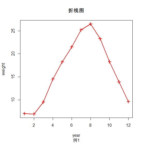
在刚绘制好的图像上添加其他点线
## 在原有图形上添加一条线,使用函数lines()
lines(data$x0,data$y2,pch=2,cex=1.2,lwd=2,col="blue",type='o')
lines(data$x0,data$y3,pch=5,cex=1.2,lwd=2,col="green",type='o')
## 添加图例,用legend() 函数
legend("topright", c("y1", "y2","y3"),pch = c(1,2,5),col=c("red","blue","green"),bg ="white")
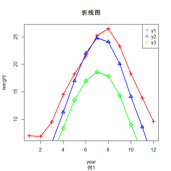
方法二:采用ggplot函数绘制简单折线图
library(ggplot2)
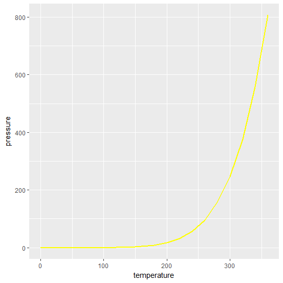
pressure #内置数据,含temperature、pressure两列
ggplot(pressure,aes(x=temperature,y=pressure))+geom_line()
对线的粗细、颜色等外观进行改变
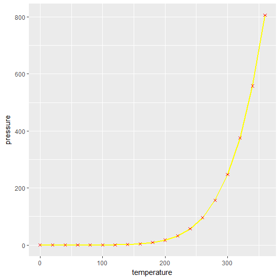
ggplot(pressure,aes(x=temperature,y=pressure))+geom_line(size=0.8,color=15)
同时显示点线
ggplot(pressure,aes(x=temperature,y=pressure))+geom_line(size=0.8,color=15)+geom_point(size=1.5,color="red",shape=4)
参数:
① geom_line()函数:绘制折现图
② size:控制线的粗细
③ color:控制线的颜色
采用ggplot函数绘制多条折线图
setwd("d:/huitu")
data=read.table("data.txt",header=T,sep="\t") #示例数据
#对数据进行简单的处理,引入type变量将y1,y2,y3分别赋予1,2,3
vd = rbind(data.frame(v=data$x0, y=data$y1, type=as.factor(1)), data.frame(v=data$x0, y=data$y2, type=as.factor(2)),
data.frame(v=data$x0, y=data$y3, type=as.factor(3)))
ggplot(vd,aes(x=v,y=y,shape=type,color=type))+geom_point()+labs(title="picture")+xlab("year")+ylab("weight")+scale_shape_manual(values=c(1,2,7))+scale_color_manual(values=c(1:3))+theme(plot.title=element_text(hjust=0.5))+geom_line()
参数:
① labs(title ="标题"):给散点图添加标题
② xlab("**")、ylab("**"):添加x、y轴标题
③ color、shape:可将分组变量赋值给颜色或形状属性,实现分组散点图的绘制(默认给定颜色、形状)
④ scale_shape_manual(values=c(*,*,*)):手动更改函数自定义点的形状
scale_color_manual(values=c(*,*,*)):手动更改函数自定义点的颜色
⑤ theme(plot.title=element_text(hjust=0.5)):标题居中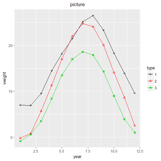
- 发表于 2017-07-22 15:22
- 阅读 ( 38759 )
- 分类:编程语言
